MDDN 241

MDDN 243

CCDN 271

CCDN 231

Saturday 30 March 2013

MDDN 241

Project 1
Materiality

Development


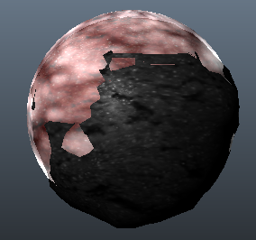
This is what the final product that I have come up with so far, and it is looking pretty cool! I like the blend of 2 colours within this form and they really do contrast each other. Also the angles that I have put the spikes I would have to say do work quite well in the end. I will have to look at what the images look like after they have been rendered, maybe a little light tweaking might be done.


MDDN 241

Project 1
Materiality

Development


These 2 images show the textures that I have added onto the little rocks at the beginning of the animation and what colour and texture it turns up at the very end as well. I went for a more dark shade here just so the whole thing now looks dead. The once alive planet has turned black, where the spikes are the only things that are actually now "living". I am liking the colours I chose with these but they look a lot different when rendered and there is still lighting to be added, so no doubt this will change some things to a degree.


MDDN 241


Project 1
Materiality

Development


I changed up a part of the frames a little with this scene. The part where the rock becomes dead and then transparent where the inner object starts expanding is now a little different. The old planet grows smoke cloud around it, then slowly turns transparent like the example below. The inner rock now shows up and explodes out of the dead planet.


MDDN 241

Project 1
Materiality

Development


Here we go, this is the development of my final form. It'll be the mystical rock that grew bigger but all of a sudden, grows spikes! Not exactly like the prototype idea but it is inspired from it. There won't be spikes growing in random places nor all around the sphere, just selected areas. Just the sides in fact, ranging from 9-12 spikes each side so it looks even enough and stands out. The images below show my process creating these spikes with the end result down at the bottom. Woohoo almost done!


MDDN 241

Project 1
Materiality

Development


Now the next set of frames are interesting. I made the planet once again transparent, but from what we see inside now, the mystical rocks are slowly growing inside. As it progresses, the rocks pretty much break through the dead planet to create a different and bigger solid object. Once again I still have not added my texture to this as I am waiting till the end to do so.


Friday 29 March 2013

MDDN 241

Project 1
Materiality

Development


My next step was to "kill" the planet. With the 2 mystical objects inside them they planet slowly dies out as you can see in the images below. The image on the left is the planet that is bright and looks like it is still fluid, whilst the one on the left is a lot darker and does not give off as much light, let alone any. It looks more like a dried Mars kind of planet.


MDDN 241

Project 1
Materiality

Development


Moving along my frames, the 2 outside mystical rocks orbit the planet and slowly get closer and closer until they both get sucked into the liquid planet out of sight. The next shot shows the planet getting infected by showing the the transparency of it, with the 2 rocks in the middle blended together. The 2 mystical rocks still haven't got textures added to them yet but I will be using the same as the planet's textures except the texture will not be moving, and they will be either white, grey or black.


MDDN 241

Project 1
Materiality

Development


After choosing my texture, I went ahead and added it onto the sphere in the middle. This will be my main texture for my planet. I liquified it as well by making it move throughout the animation. I'm very pleased with how it turned out especially in the render. Compared to the previous render that I did it is a lot brighter. It will need to be brighter later on though and I will need lights to fix that but that will probably be one of my last steps. The planet though looks liquified and fluid indeed, I can't wait to see this finished.


MDDN 241

Project 1
Materiality

Development/Textures


So my previous texture that I used wasn't quite fit for match for what I need to do. I need to make a texture that will look like a planet, and I've got 4 textures below, some slightly photoshopped but I guess that would be okay. The first one looks really grungy and the amount of red strapped onto a sphere would almost look like continents. However I don't think I will use this one just because it barely has any colour spacing. The second image would look great if it were to move, almost like a red ocean texture in the sphere. The third texture would also look cool as it has that grunge style to it. The only problem with this one is that is it quite dark on the borders so it might not look that all great on the sphere. The last one however is my favourite, as you can't quite put your finger onto what kind of texture it is. It is rocky however and will add a great texture to the sphere/planet. 

Image Retrieved from http://fc06.deviantart.net/fs16/f/2007/209/1/a/Black_and_Red_Texture_by_slw381992.jpg

Image Retrieved from http://static.freepik.com/free-photo/red-textures-material-texture_3115368.jpg

Image Retrieved from http://us.123rf.com/400wm/400/400/ngonhan/ngonhan1210/ngonhan121000601/15851371-dark-red-grunge-metal-mesh-background.jpg

Image Retrieved from http://lkng.files.wordpress.com/2010/01/red-velvet-texture1.jpg


MDDN 241

Project 1
Materiality

Development/Proposal


After a long thought about what I should do, I finally picked one and decided to go with the planet idea. I figured that it's a new idea, and it would look cool once it's finished. I want to start off with a planet with 2 other mystical things floating around it. Eventually they would somehow combine as one whole object. Through time the bigger planet would get infected and then explode into something similar to the tendrils in the game prototype. This is just the basic wireframe that I have created for my first form. 


MDDN 241

Project 1
Materiality

Development


I decided to attempt to make my first form which would pretty much be a basic sphere in maya. What I did need was a texture to add to it. Since I was still unsure if I should do a planet or a little cell, I just made a start and found this cool looking "virus-like" texture. It came in green in the images when I found it so I photoshopped it to make it red, so it would match my own requirements. 

Image Retrieved from http://wallpaperdev.com/stock/virus-green-wallpaper.jpg
I took a screenshot of my attempt at making my first shape. Bare in my mind this is my first time that I have ever used the program Maya so it's just a start. I made my sphere, added the textures to it i.e. the red virus map. Then added the bump and specs map to it to give it a more 3D looking texture, which to my surprise turned out really cool. The next thing I did was that I started to sculpt and shape my form, following the virus lines and bringing them up like in the image below.


After what I thought was a pretty reasonable first go, I rendered the model to see what it would look like. It was dark. Very, very dark. You can still see some 3D kind of effects in it and the red does actually contrast well in the darkness but it needs to be lighter. If not, then I will need to change my texture and have one that has more "goings-on" within it.


MDDN 241

Project 1
Materiality

Research


One thing I randomly thought of was the main shape of a little cell, or something similar like a virus or an atom. The simple (not-so-simple) structure of a little nucleus even with the electrons orbiting it. This somehow led me to the idea of investigating planets. Yes, planets. I thought I would elaborate the idea of having a basic and small sphere as a starter shape to expand it to something ridiculously massive like a planet. Of course I will still go with my idea of a prototype style of explosion for it but it would have to start off as something pure, and then maybe slowly getting infected by some outside source. I researched some inspirational images of outer space and planets and have found these 2 images below which really captured my attention. I like the first one because of the aura's around the planet. As we can see there is a lot of movement in this image and it would be great to try and create this as a model. Exactly the same with the second image. I particularly like this one because it introduces another planet or object in the image.


Image Retrieved from http://images5.fanpop.com/image/photos/30900000/planets-astronomy-30987566-1600-1000.jpg 


Image Retrieved from http://chchcheckit.com/wp-content/uploads/2012/01/3D-Planets.jpg

Wednesday 27 March 2013

MDDN 241

Project 1
Materiality

Research


Looking back at my first concept, I needed to actually research what cells and viruses looked like so I had a clear idea of what their structure consist of. The first image is of the cells of the human body. Most of us have seen this image at least once before somewhere. By just looking at it, I can almost imagine myself starting off with a basic sphere, and working my way to make something similar to this design. The textures and materials wouldn't be hard to do either but I wouldn't have it that exact colour, I was thinking more of the colours that the second example uses.

Image Retrieved from http://www.balancedhealthtoday.com/images/Viruses.jpg

There was something about this image here that captured my attention. The colours were obviously the first thing that came into my mind. But the fluidity of this still image looks like it's about to just jump out at you and attack. It leaves us dazzled and curious about what just happened and what was about to happen. It seems like the shape isn't really symmetrical either and seems more randomised which is another bonus; I can definitely keep this in mind for my development.
Image Retrieved from http://www.futurity.org/wp-content/uploads/2012/05/mitochondria_525.jpg

MDDN 241

Project 1
Materiality

Research


Just so we're on the same page, I have found a video on YouTube that shows how this attack works and the physics behind it. As you can see, he powers up, then explodes shooting tendrils attached to him attacking everyone around him in slow motion. This inspired me to develop my idea more since this one video gave me so many ideas. One of the things I liked was the slow motion and camera angle work when the attack commences. Slowly zooms out and pans around the main character. I will most probably use this for at least one of my camera angles in my animation.


Video Retrieved from http://www.youtube.com/watch?v=ieQ0rXQ4z-U

MDDN 241

Project 1
Materiality

Research


Looking through my concept sketches, I have decided that I wanted to work with the first idea, since it's something different and something pretty cool. I am taking the main idea from the popular console game: prototype. As you can see from the image below, I like the shapes and forms the main character; Alex Mercer, takes when he uses his special attack. The tendrils extend and pretty much annihilate everyone in the area around him. It would be cool to design and create an object that mimics these actions and expand from a smaller form to a bigger form.

Image Retrieved from http://www.gamecrashers.net/wp-content/uploads/2010/04/prototype_042508_7263.jpg

Monday 18 March 2013

CCDN 271


Assignment One

Tools For Investigation - Assessing and Critiquing Sources


The Everyday

Michael Graves Designs: The Art of the Everyday Object is the inside account of Michael Graves one-man revolution. The acclaimed architect has elevated everyday objects from toasters to toilet brushes into enduring icons that have redefined how we look at them today. With his resounding successful work for Target Stores, Michael Graves has become a household name. Graves states that one of the most important characteristics of many of his projects is “domesticity”. Although he mentions that we flourish in surroundings that support our spiritual and physical needs, well designed products tell stories about the way we live and what we care about. He liked designing things that were efficient to use but at the same time, made everyday tasks more enjoyable through careful design and shapes and colors. Because what looks good often feels good, he developed stylish knobs and handles as an example, that fit well in our hands. Therefore the object and our body have a relationship with each other.

Patton, P. (2004). Michael Graves Designs: The Art of the Everyday Object.
New York, NY: Melcher Media Inc.


Critical Design

Bucsescu and Eng’s book examines the relationship between the built form and culture and serves as an introduction to thinking philosophically about design theory for students in design and architecture. It is targeted at first year students, and also be resourceful for advanced students who can return throughout their design training. The text starts off with the first chapter asking - “What Is Critical Thinking?” with a separate part on how to critically think in design. The book is cleverly written where 2 different people are talking to each other, one philosophical (Philo) and the other architecture (Arch). Philo stated, “the student should learn how to edit his work (i.e., reflect on it in more than one draft), and that the editing process should be imagined as knowing on the walls of a structure to see which parts of the structure were sounds and which were hollow. This was merely an architectural metaphor, which could be employed in design as a way to test how designers conceptualize their projects.

Bucsescu, D., & Eng, M. (2009). Looking Beyond The Structure: Critical Thinking for Designers and Architects. United States of America: Fairchild Books.


DIY

Do it yourself (DIY, D.I.Y.) is a term that focuses on people creating things for themselves. It is encouraged by DIY subcultures that people should take technologies into their own hands and “explicitly critique” consumer culture. Zapata explains that in order to find new terminology in sustainable design, with recycle, reduce but mostly reuse thinking (Zapata. pg1.). The focus is in contemporary “do it yourself” culture and it’s creative incorporation in academic experiences of architectural self construction. Zapata also signifies the benefits of DIY, with the low energy costs of it, and the practical learning that takes place. The use of manuals along with graphical instructions expresses the “How to” and the “ready made” building elements, which make new frontiers to conceptual design.

Zapata, A. F. (2007). 21st Century D.I.Y. Architecture.
Retrieved from http://www.unaus.eu/pdf/T013.pdf


Google Warming

The text starts off with Solove claiming that “We are in the midst of an information revolution, and we are only beginning to understand its implications” (Solove, pg. 1.). During the past few decades, we have changed the way we do our day-to-day business; the way we shop, bank, social interaction. This has resulted in an unprecedented amount of records and data of individuals. He then mentions dossiers, which is a collection of detailed data about an individual, and how dossiers are used in European courts to assemble information about someone to reach a judgement. On page 7, the writer talks about “Orwell’s Big Brother”. He states that Big Brother is the “dominant metaphor” for modern invasions of privacy, oppressing it’s citizens, spying on everyone in their own homes, resulting in a “cold” and “grey” world with no creativity. 

Solove, D. J. (2004). the digital person: technology and privacy in the information age.
New York, NY: New York University Press. Retrieved from
http://books.google.co.nz/bookshl=en&lr=&id=_bodvczXUIsC&oi=fnd&pg=PR7&dq=the+digital+person&ots=wotu0tWmST&sig=FmPF0Vi2QRnnDgoQjfeBsJ9Co0A#v=onepage&q=the%20digital%20person&f=false

Thursday 14 March 2013

MDDN 241

Project 1
Materiality

Concepts

After researching through countless images and precedents trying to find the inspiration that I had needed, I finally came to the final..of my concepts. I have decided to make things more difficult for myself as usual and attempt to use my tablet (iPad) to draw them digitally, using the program that I had recently bought called SketchBook Pro. Of course it was my first time using it but I am happy with how the drawings turned out in the end and they really show what my ideas are. 

The first concept came from the game Prototype of course. I chose to start it off with something that looks solid but seems to have something liquified inside it, almost like it's infected with something. I have added shadows to my objects as well to label if it is on the ground or not. This first one shows the dark and evil overpowering it's outer shell, shrinking its natural shape. Gradually overtime, it bursts out to a whole new form which looks like the true form of what was once the red infection of the first shape. 

The second concept was inspired from an image that I had  seen on deviantart. I have created a solid black form with 3 fluid forms floating around it, creating a a clustered shape as a whole. The black mysterious shape gradually absorbs the other shapes to then create something heavy and solid, which drops onto the ground.

My last concept was inspired by Salvador Dali. This shape starts off with a very flexible and fluid form then falls and slips down to the ground to create something solid and organic, almost tree-like. I chose the colours because they are opposites. With purple being the liquid and green being the more solid and organic shape, promoting each others forms.


MDDN 241

Project 1
Materiality

Researching through the artwork or my precedents, I came across one of Salvador Dali's paintings. The one thing that caught my eye was the clock hanging from the branch. I liked the shape it gave to the normal everyday object, liquifying it and all of it's attributes. I thought this would be a cool idea to develop later on.

Image Retrieved from: https://blogger.googleusercontent.com/img/b/R29vZ2xl/AVvXsEiwnbxCQUoFyWdJeZ_UidiTUJhmuf_19j9iq4_Q39OO7XN865LUn9zZYok6ApJDM_3GHNItno4F_8TS-YkFlCxKcDc-0vkQHfUCqrkWOALhKvA9Y8i-ol1cyTaJkNAYBsYOLNB0Sgd4DUU/s1600/the_persistence_of_memory_1931_salvador_dali.jpg

MDDN 241

Project 1
Materiality

I found another image whilst looking through deviantart.com to see if anyone out there has the power to inspire me through my journey in this project. I stumbled across this image here and I quite liked the many cluster-like forms and shapes in it. They all assist each other into creating a bigger shape/a bigger picture. I thought this would be a good idea to reflect on and create something similar to it.

Image Retrieved from: http://ryanr08.deviantart.com/art/Weird-Shapes-279314539
designed by "ryanr08" @deviantart.com

MDDN 241

Project 1
Materiality

Whilst researching, I thought back to the games I have played in my past that could have interesting shapes and forms in them with one game coming to mind. Prototype. If you've ever played this game, you can tell why this is inspirational to me. If you observe the image below, you can see a human being, a man, that has his arm transforming into what looks like a blade. What I like about this game is that you have the power to transform your limbs into many different things similar to the one in the image. I mainly like the colour and style used in the design of his arm from sharp pointy edges to long gazing tendrils.

Image Retrieved from: http://coolvibe.com/wp-content/uploads/2010/09/1052015-prototype.jpg

MDDN 241

Project 1
Materiality

For the first part of this project, we are required to have 3 concept sketches of our first ideas. We were given recommended precedents which are:

- Hannah Hoch
She was best known for her photomontages, and upon researching and browsing through her work I found that she has a lot of few abstract forms within her work. Although her work is definitely interesting, it didn't inspire me with any ideas.

- Lazlo Moholy-Nagy
He was a great painter and a photographer and was highly influenced by constructivism. I like his work because it is plain and simple in some cases and got a few ideas from the photography of some of the architecture within the images.

- Salvador Dali
He was a very interesting surrealist painter with amazing artwork that just gave me the inspiration that I had needed. I like the many shapes and forms in his paintings, very abstract.

- Francis Bacon
He was a very graphic and emotional figurative painter. He has some work that have good use of abstract forms in them but I didn't find any use for them when coming up with my ideas, mainly because he with people's faces.

- Patricia Piccinini
She is a hyperrealist sculptor, with a lot of strange but yet interesting designs. It's definitely something I have never seen before and although I would like to look into her work more, I don't think I will be using anything like this for my project. It just doesn't fit my, style? Yes, that's the one.

- Damien Hirst
He is an entrepreneur and an art collector. Most of the work that I had a look at by him were animals, but similar to Piccinini's work; they were out of the ordinary. As fascinated as I am, I don't think I'll be using him as my artist model either.

Other things I decided to research were just normal shapes and forms, and also found some cool game inspirations that will help me get ideas for my concepts that I can later on develop more in depth.